Failure Resume
A reflection on the things that I’ve done wrong and what I can learn from those events, wrapped up in a design exercise.

Why?
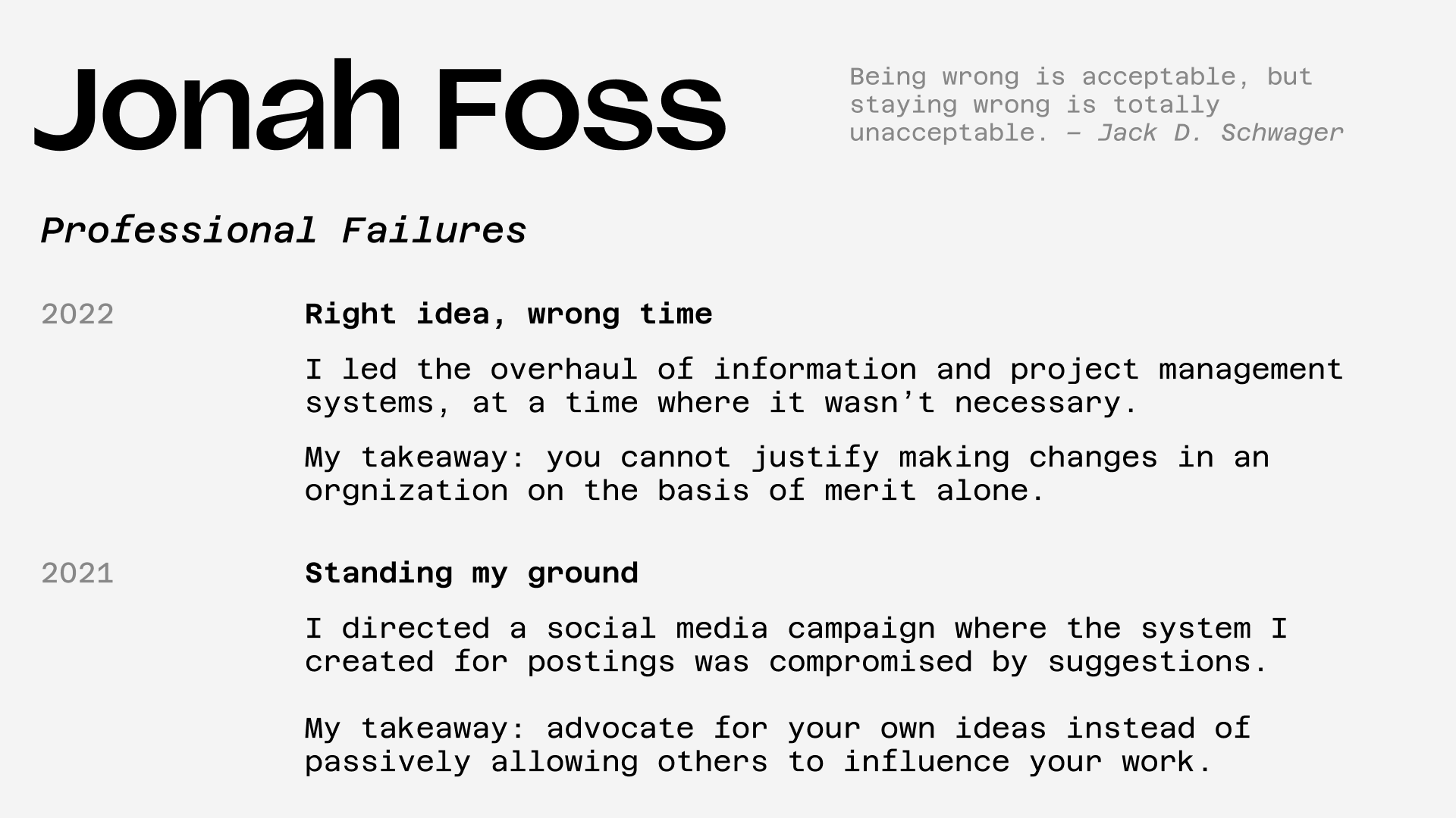
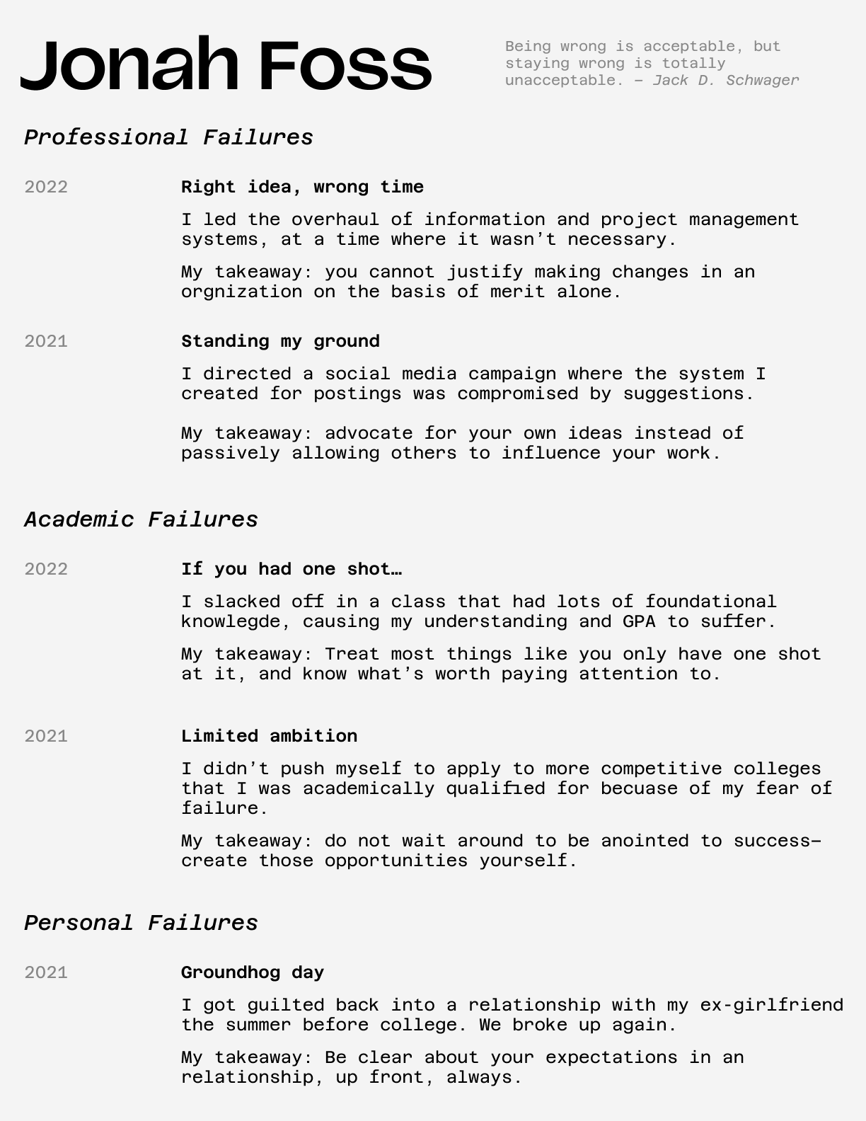
I was reading Tina Seelig’s What I Wish I Knew When I Was 20 and she presents the idea of a “Failure Resume”, a résumé that “summarizes all [the] biggest screwups—personal, professional, and academic. For every failure, each student must describe what he or she learned from that experience.”
As I’m reviewing some of what I consider to be my biggest failures and posting them on the internet– I felt the least I could do was to make it look pretty. I am particularly happy with the font pairing:
- My name is written in Vazilas from Luzi Type foundry (I am using their sample version for a noncommercial purpose).
- Everything else is in variations of Azeret Mono.

Reflection
I can’t understand why, but the placement of the quote in the top left throws the page off balance. I prioritized readability over everything, so the font size is larger than I’d normally put on a resume, but considering it isn’t a real one it’s probably OK.
I could list all my criticisms about this and turn it into another failure resume about my failure resume that fails to fulfill at its intended purpose, but that’s too meta.