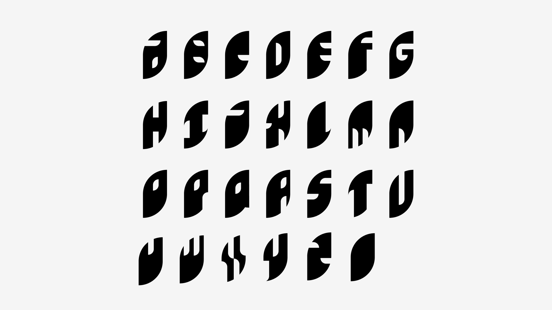
Leaf Alphabet
An exercise where I tried to cut out all 26 letters of the alphabet from one shape.
Tags: Design
What it is:
How it came to be:
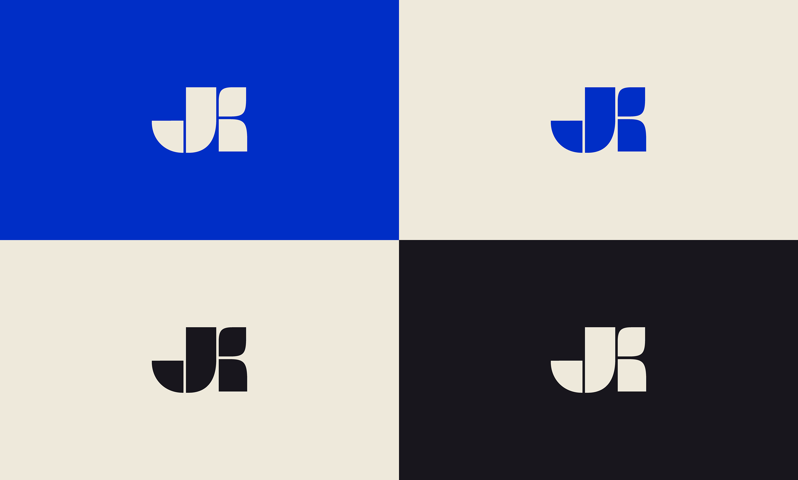
I was browsing bechance and came across this post from Jagoda Kolodziej. I was fascinated by the geometry and bold blue color.
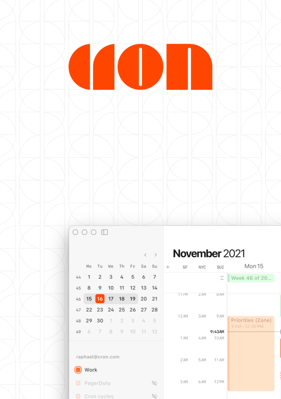
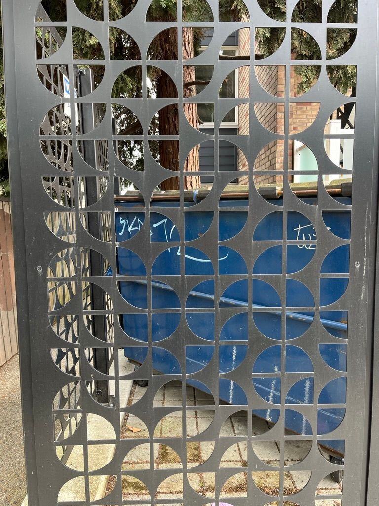
The pattern was also reminiscent of repeating geometry from graphics advertising calendar app Cron (and a fence with a really similar pattern!).
I stared with making my initials, “JF” with the same three geometric shapes: half-circles, squares, and smaller circles. I tried to abide with a 2x2 grid for the iterations incorporating the orange circles.
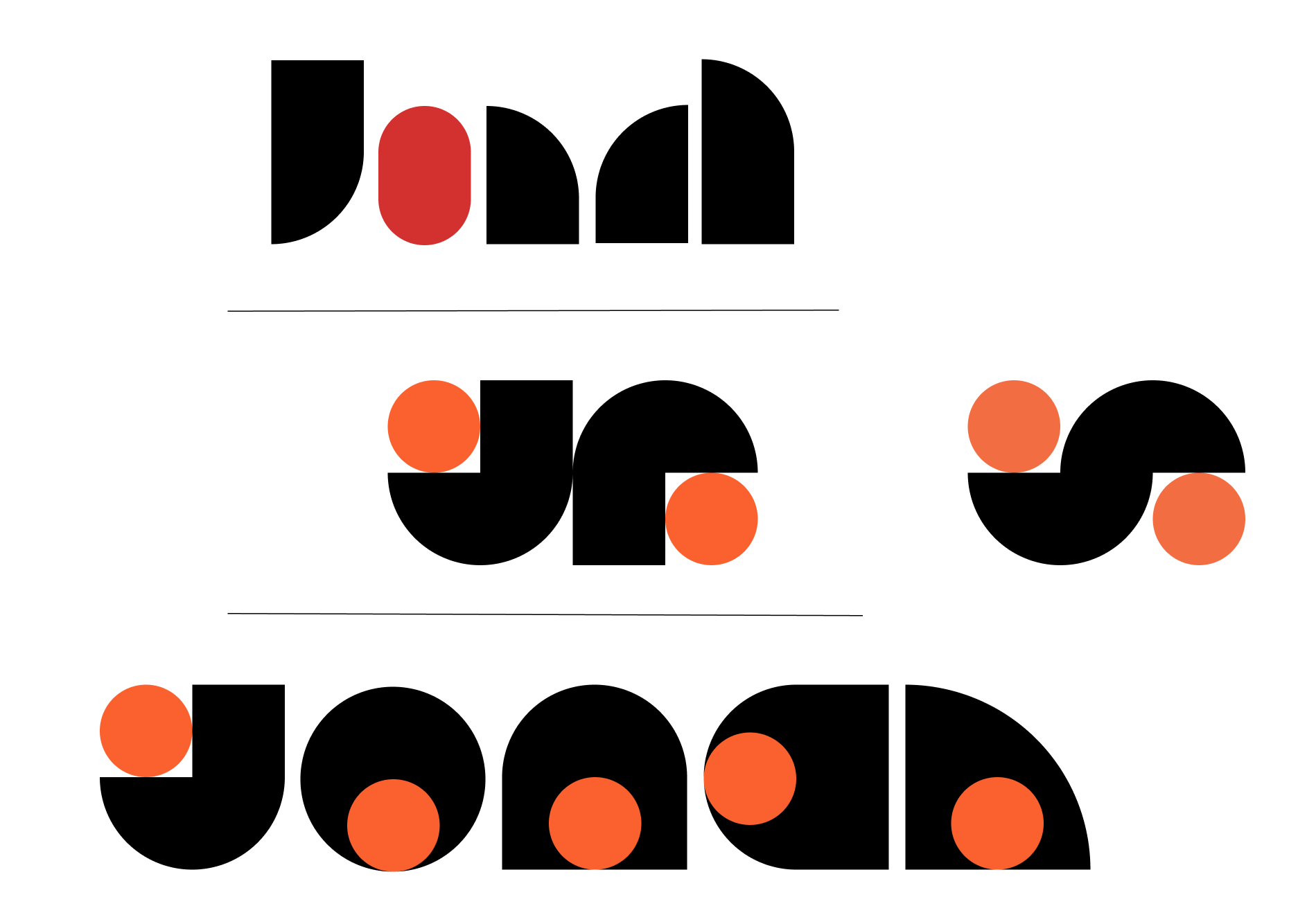
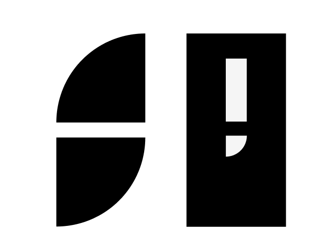
Eventually I settled on using two quarters of a circle to create the leaf-like shape that is seen in the majority of the letters. To standardize the counter (enclosed space) of each letter, I used a rectangle and a quarter circle (see below).
Chiseling each letter out from the same shape while maintaining visual continuity was a challenge, especially since I would have to remove a lot of each shape for letters with ascenders and descenders. I also found “Q”, “Y”, “N” and “X” particularly difficult.
Feedback + further implications
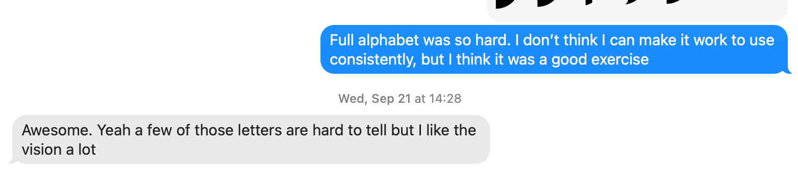
Because this was super experimental, I wasn’t designing for legibility more than I was just trying to challenge myself to create a set of letters. I agreed that the letters had very few, if any practical applications, but I found ways to present their strange visual appeal:
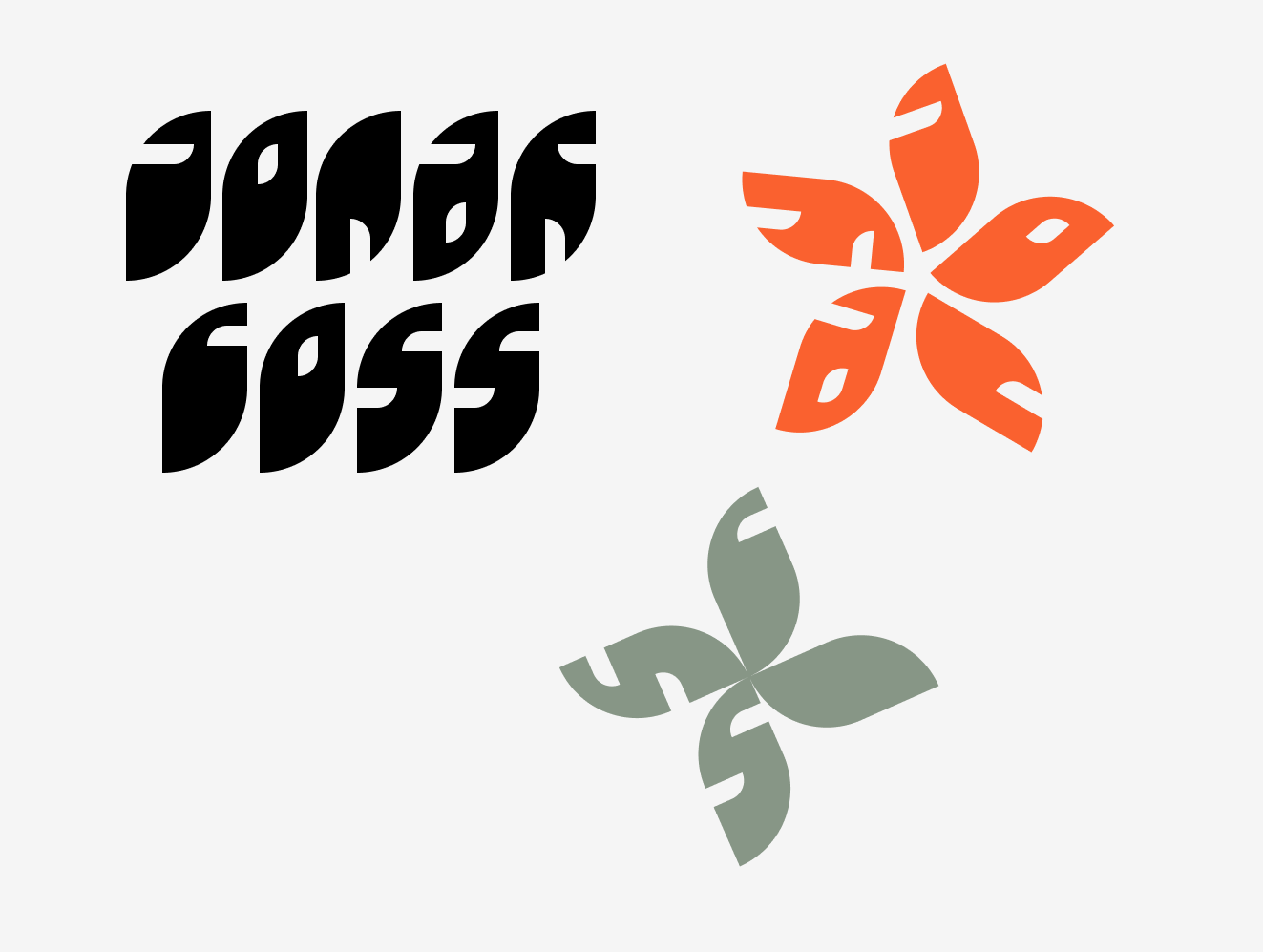

With few enough letters, I could write my name (somewhat legibly), and because of each letter’s leaf or petal-like shape I also found myself arranging them in a way that mimicked flowering plants. Finally, I created a stylized LinkedIn banner that attempted to utilize the geometric repetition that I had admired in other designs.