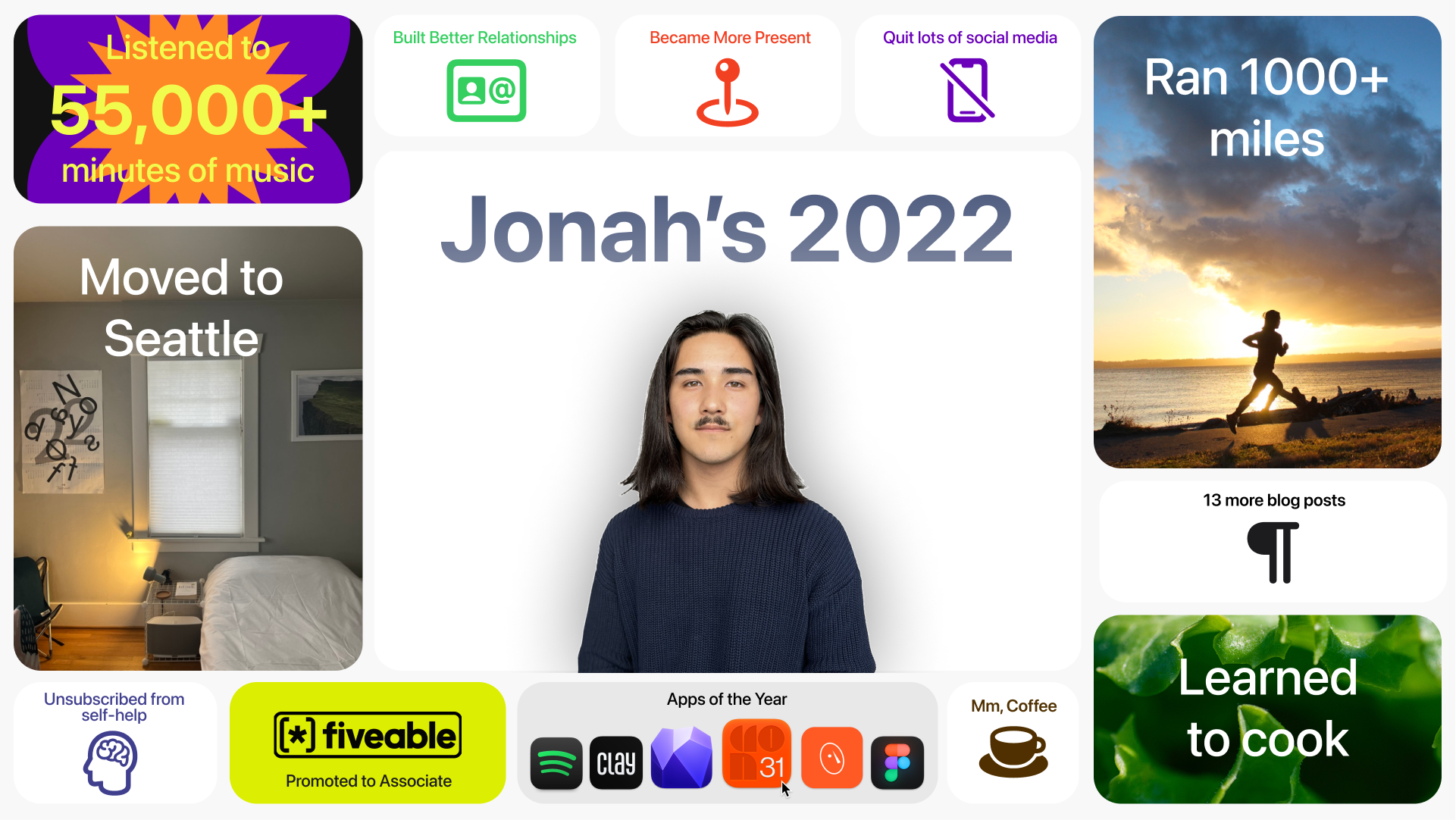
2022 recap
A visual recap of some of the things I did in 2022, inspired by Apple Keynotes.
Why?
I grew up watching a lot of Apple Keynotes. I’d even watch hour-long replays for fun, to see the clever animations, the excitement of the crowd, and feel the nostalgic rush of seeing products like the iPhone X shown to the world for the first time.
At the end of each keynote section, the speaker would summarize the announcement with a grid arrangement that showcased the features of the new product or service.
I liked the format, so I worked in Figma to get the corner radii correct, and the SF symbols from this community post.
I tried my hand at this for the first time in 2021: 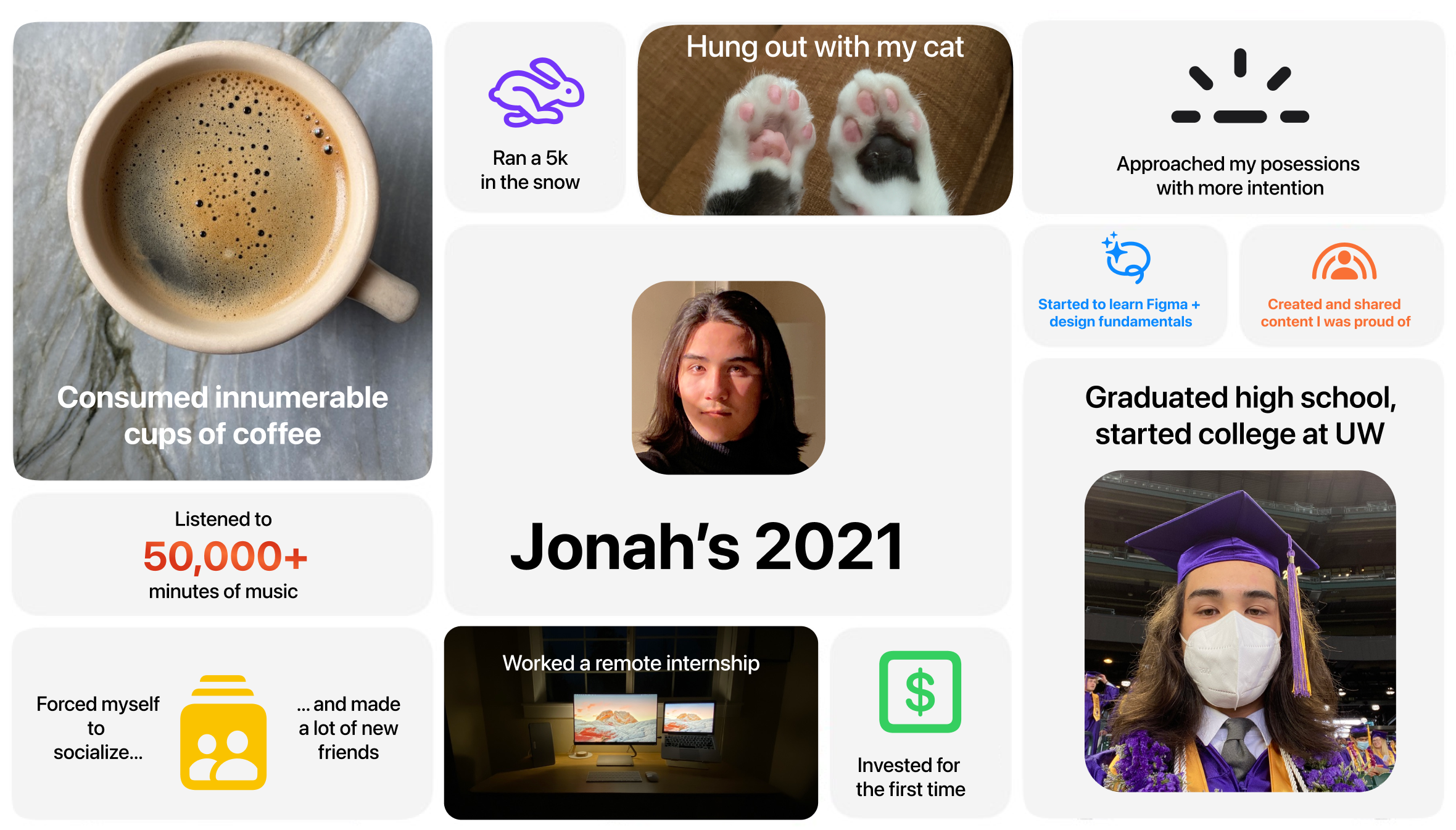
Reflections
While the 2021 version is more true to the original aesthetic, I like the 2022 version better for a number of reasons:
- Variety
The section about my 55000 minutes of music was inspired by 2022’s Spotify wrapped design, which I found challenging to fit into that smaller space. I also had a lot of fun with the “apps of the year” section, which was intended to emulate the dock from MacOS. - Time
The 2021 version took me well over 3 hours, between finding the corner radius, deciding what icons to choose, and making sure everything was aligned the way I wanted to. The 2022 version to me just under an hour. - Recognition
Regardless of their knowledge of the apple keynote recap screen that inspired this project (literally no one), I was excited to see that the people who I showed this project to felt inspired to reflect on what they had done over the past year.
I plan to continue this project annually, and I’ve realized it’s a solid measure of my proficiency in Figma since I stared learning how to use it on my own in 2021. Ultimately, it’s yet another practice in self-reflection, which I’ve done plenty of in writing but would be even better represented visually.